


ⓘ Creative Direction, Branding → 2019
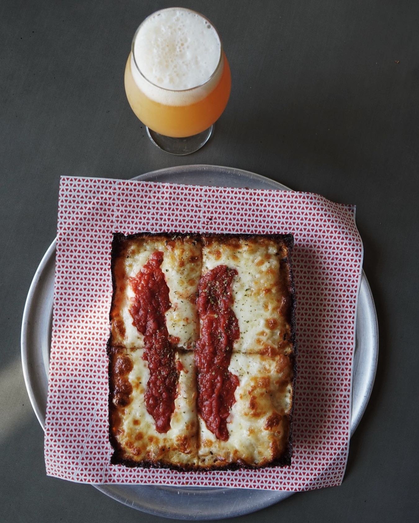
Slice Project is a NorCal based Pizzeria offering New York & Detroit style slices, pies and local craft brews.
The Sencion bros always dreamt of opening up their own pizzeria. In 2019, they took the leap. We’ve been friends for decades, so when they reached out to collaborate, I knew I had to lend a hand.

Landscape
The dudes knew they wanted to break the mold from the get go.
As 90’s kids who grew up watching TMNT, skateboarding and going to backyard punk shows, that same sense of energy and individualism needed to carry over into every facet of the identity system.
Raw, organic, hand made. Just like their pies.

Visual System & Identity
We’ve all see those old-school Pizzeria logotypes and marks—the ones you see on every corner or stamped on forgotten brochures. There’s a nostalgic sentiment we might share for such things, but maybe because we’re just so used to seeing them everywhere.
Working closely with SP, we knew that was a point worth exploring, but ultimately decided on exploring something we could own.
Type treatments & styles
To understand what it means to open up a restaurant, let alone a Pizzeria, in our hometown of Watsonville, CA, you first need to know about local demographics.
Out of the hundreds of Taquerias, Mexican fonditas and your corporate fast-food spots, about 10 of those are local Pizza joints.
Some with decades of serving the community with their unique takes—spots we all grew up eating slices at and hold a special place in our hearts.
A mark that could stand its ground and stand out amidst repetitive colors and generic typography.
Then it dawned on me.
What if the globally recognized slice shape somehow integrated into an SP monogram?


