


ⓘ Brand Identity → 2016
Google’s next-gen framework for developing intuitive applications for interconnected devices.
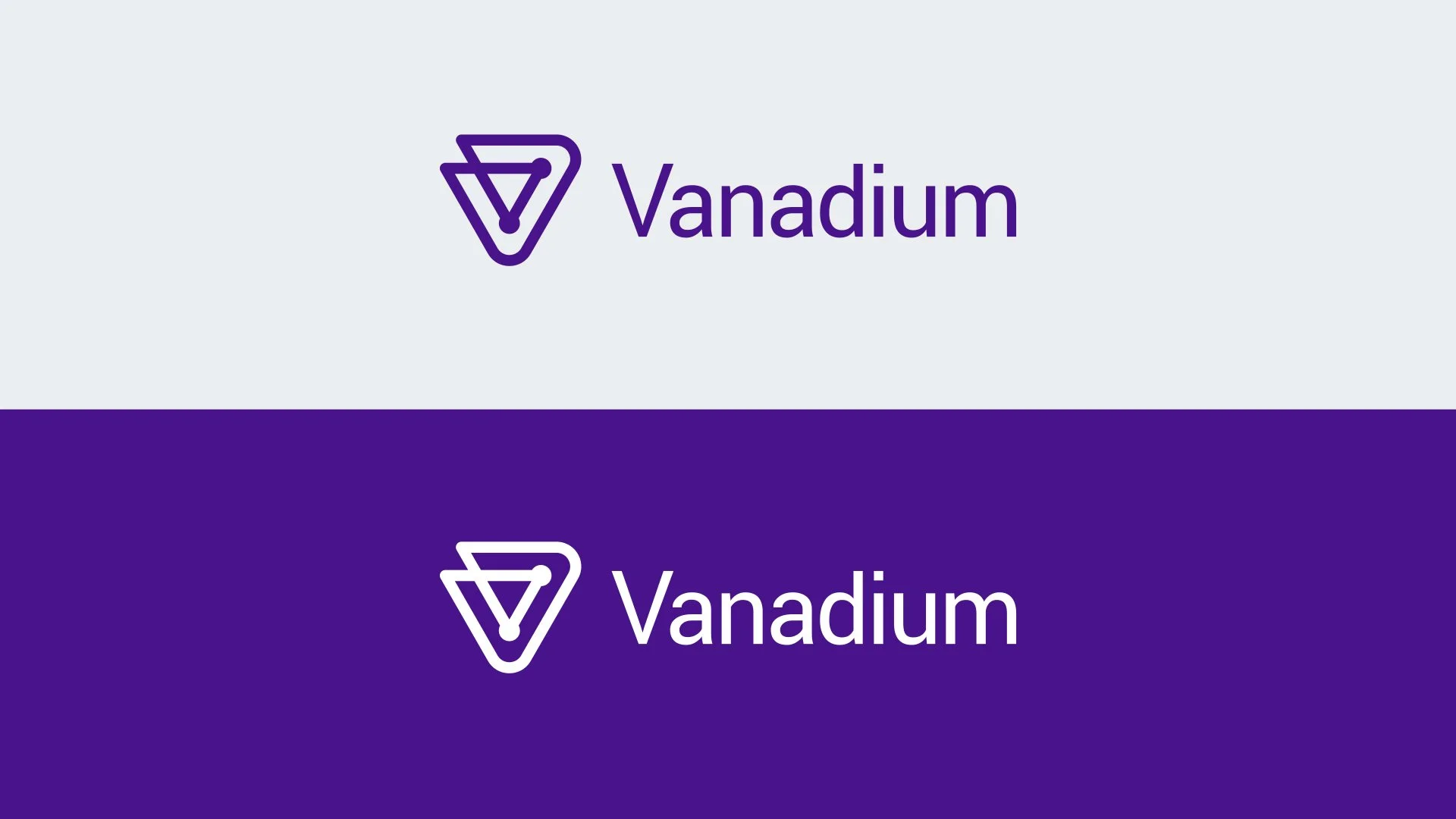
Their audience is comprised of engineers and individuals in the Tech industry. We created a visual identity that’s both recognizable and follows the Material Style Guide.

Reference from the Material Design Library
Adaptive Material
As one of Google’s preferred Creative partners during the time, our Design team was able to get first dibs on the recently developed Material Design language.
Working within established parameters was a challenge, but helped us narrow down certain attributes. We dug into every bit of inspiration and reference available.

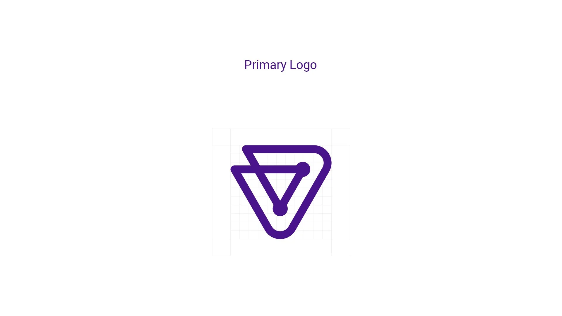
Logomark
The V is the primary logo mark of Vanadium.
It’s composed of connected nodes & pathways, a metaphor for all the connected devices running on the Vanadium framework.
It has been crafted to stand as an independent, strong, and recognizable mark.

Typography
Vanadium uses the Roboto font family for all elements.
This is consistent with the typography guidelines on the Google Material Style Guide.


Material type styles
Iconography
In addition to developing an identity, we also created a suite of recognizable icons. Objects like devices, refrigerators, and even a smart dog bowl—anything that could run on Vanadium.
Icons are designed for versatility and clear readability. They can be used within the interface, brand collateral, graphics, and diagrams.